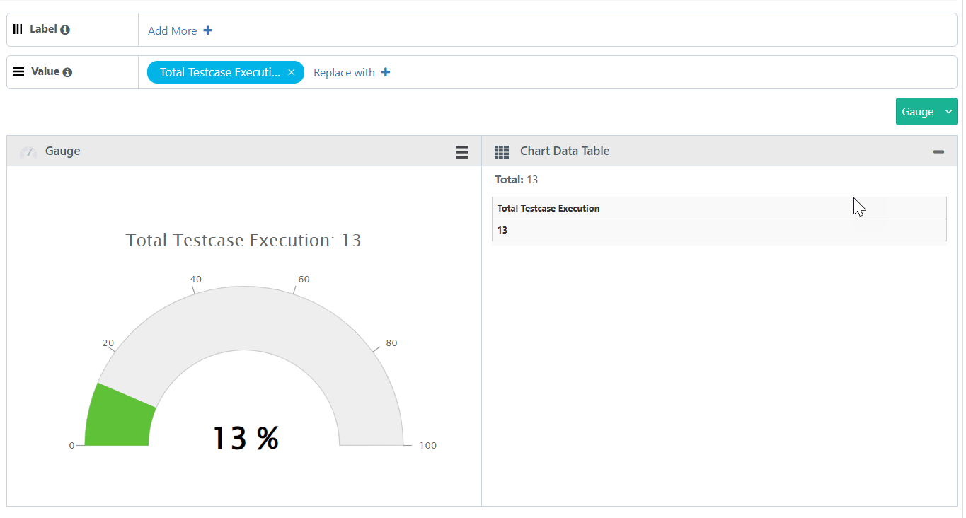
Gauge Chart
The advance report Guage chart is used to display the percentage of a type from total number of records.
Generate a chart that displays the Percentage of Automated Executions for a combination of a Project, Release, and Cycle.
SQL Query
Percentage Of Automated Executions For A Project, Release, and Cycle
SELECT
COUNT(testcases.entityKey) as "Total Testcase Execution",
COUNT(CASE WHEN testexecutions.isAutoExecuted=1 THEN 1 END) as "Automated Execution",
COUNT(CASE WHEN testexecutions.isAutoExecuted=1 THEN 1 END)/COUNT(testcases.entityKey)* 100 as "Percentage"
FROM testcases
inner join testexecutions on testcases.testcaseID = testexecutions.testcaseID
and testcases.tcVersion = testexecutions.executedVersion
WHERE testexecutions.projectID in (`@filter.project`)
AND testexecutions.releaseID in (`@filter.release`)
AND testexecutions.cycleID in (`@filter.cycle`)
Query Output
It gives you output in tabular format. Modify the output format by switching it to the Gauge Chart.
Adjust the Columns based on the requirement to the Label and Value sections.
Label always holds a single Test entity field with any value.
Value always holds a single Test entity field with any value (i.e. with numeric values).
 |
Once you get your desired report, you can save the report as a Gadget by clicking on the Add Gadget button.
Once you save the gadget, it becomes available in QMetry Custom Gadget under My Gadget tab.