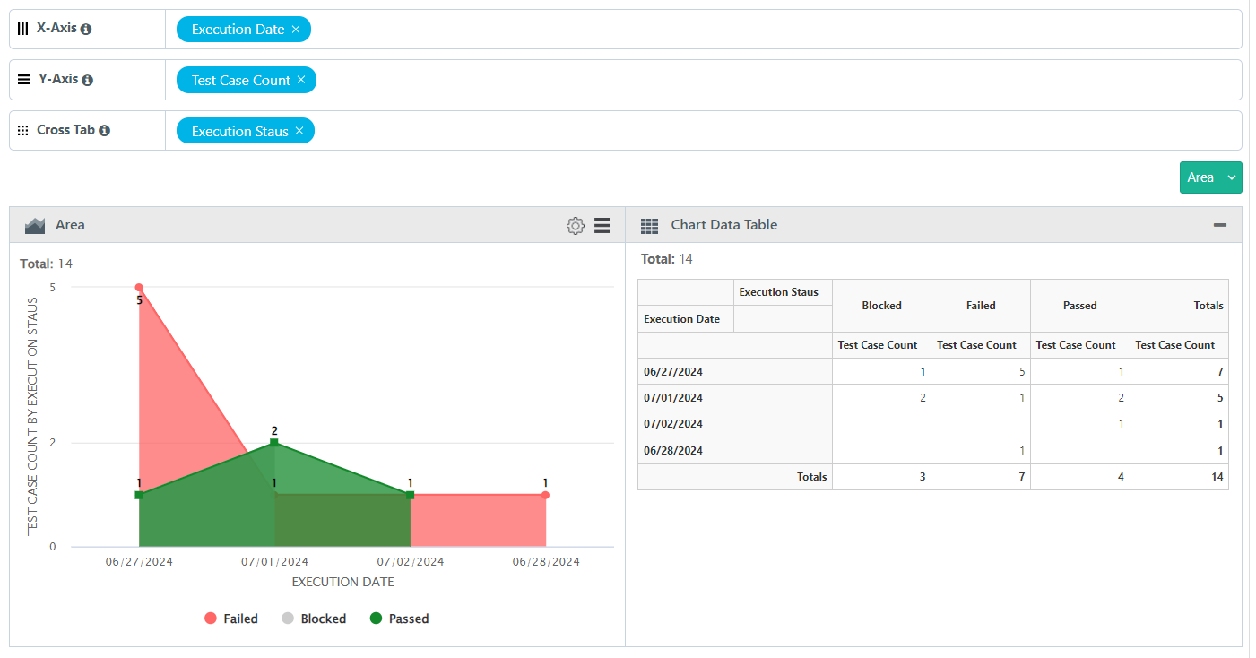
Area Chart
An area chart represents the change in a one or more quantities over time. It is made by plotting a series of data points over time, connecting those data points with line segments, and then filling in the area between the line and the x-axis with color or shading. Let’s take an example of an Area Chart report.
Generate an area chart that displays the Count of the test cases executed per day along with the execution status
SQL Query
Test Case Execution Per Day
SELECT
DATE_FORMAT(testexecutions.tcExecutionEndTime, "%m/%d/%Y") "Execution Date",
testexecutions.tcExecutionStatusName "Execution Staus",
COUNT(1) as "Test Case Count"
FROM testexecutions
WHERE testexecutions.projectID in (`@filter.project`)
AND testexecutions.tcExecutionStatusName NOT IN ("Not Run", "Not Applicable")
GROUP BY DATE_FORMAT(testexecutions.tcExecutionEndTime, '%m/%d/%Y'), testexecutions.tcExecutionStatusName
Query Output
By default the output is in Tabular format, modify the format to view it in Pie chart.
Adjust the Columns based on the requirement to X-Axis, Y-Axis and Cross Tab.
 |
X-axis always holds a single Test entity field with any value.
Multiple Test entity field on Y-axis creates a stacked chart; Y-axis always contain fields with numeric values.
Cross Tab field will help to create a Group Stacked chart.
Click Add Gadget to save the report as a Gadget.
Once you save the gadget, it becomes available in QMetry Custom Gadget under My Gadget tab.