Column Chart
A column chart is a data visualization where a rectangle represents each category. The height of the rectangle is proportional to the values plotted. The column charts are of two types:
Basic Column Chart
Stacked Column Chart
In QMetry, the Advance SQL Query helps generate both the charts as with the required values. Let’s understand how writing a SQL queries in detail can generate both types of column chart.
Generate a chart that displays the Count of the test cases by their assignees.
Count of Test Cases by Assignee
SELECT
COUNT(testexecutions.testcaseID) as "Testcase Count",
AssignedTester.userAlias as "Assignee"
FROM testexecutions
JOIN users as AssignedTester ON testexecutions.assignedTester = AssignedTester.userID
WHERE testexecutions.projectID in (`@filter.project`)
GROUP BY testexecutions.assignedTester
Query Output
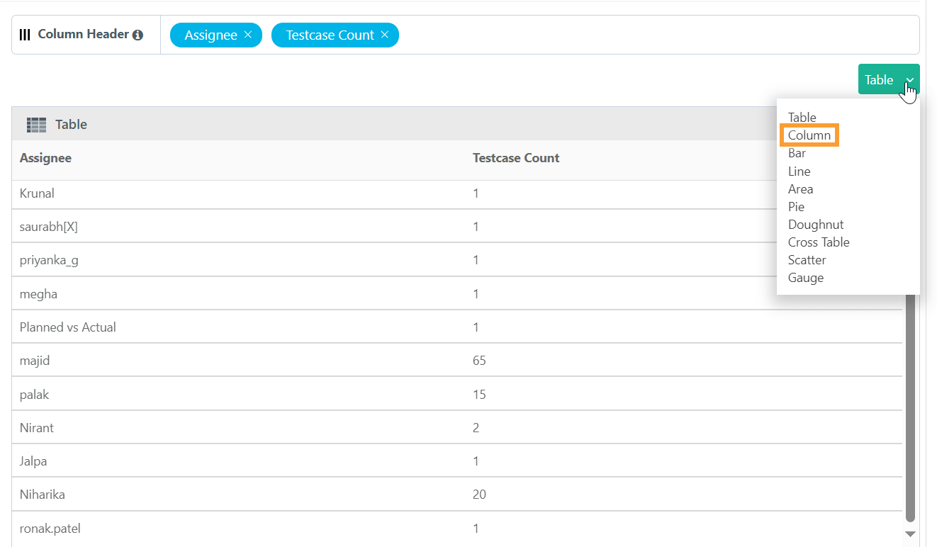
The default output is in tabular format. Modify the output format by switching to the available chart types from the table.

Adjust the Columns based on the requirement to X-Axis, Y-Axis and Cross Tab.
X-axis always holds a single Test entity field with any value.
Multiple Test entity field on Y-axis creates a stacked chart; Y-axis always contain fields with numeric values.
Click Add Gadget to save the report as a Gadget,
Once you save the gadget, it becomes available in QMetry Custom Gadget under My Gadget tab.
Generate a chart that displays the Count of the test case execution per release in a project (i.e. Count Of Test Case Execution Per Release).
SQL Query
Count of Test Case Execution Per Release
SELECT
testexecutions.releaseName as "Release Name",
testexecutions.tcExecutionStatusName "Exec Status",
COUNT(1) as "Execution Count"
FROM testexecutions
WHERE testexecutions.projectID in (`@Filter.project`)
AND testexecutions.tcExecutionStatusName NOT IN ("Not Run")
GROUP BY testexecutions.releaseName, testexecutions.tcExecutionStatusName
Output Query
The default output is in tabular form. Switch to the available chart types from the table.

You can adjust the Columns based on the requirement to X-Axis, Y-Axis and Cross Tab.
X-axis always holds a single Test entity field with any value.
Multiple Test entity field on Y-axis creates a stacked chart; Y-axis always contain fields with numeric values.
Cross tab field will help to create a Group Stacked chart.
Click Add Gadget to save the report as a Gadget.
Once you save the gadget, it becomes available in QMetry Custom Gadget under My Gadget tab.